Line Chart
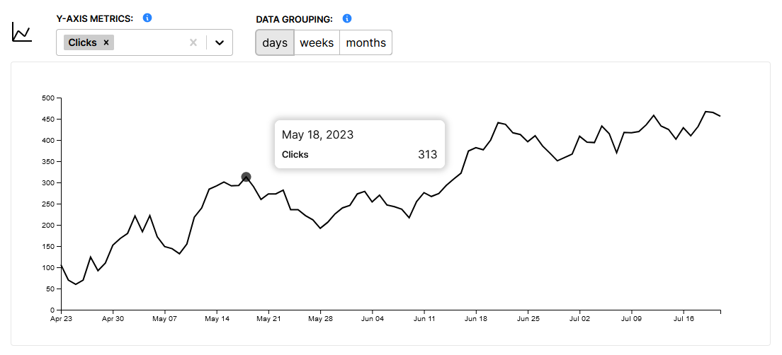
The line chart shows performance over time. The X-axis metric is always time, while the Y-axis metrics can be changed to any metric available in the report data.
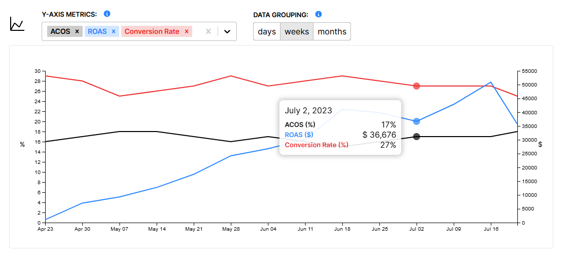
Dual Axis
In this case we have a dual Y-axis line chart. This is necessary if we want to display two metrics with different scales.
For example if we want to compare cost, which is represented in dollars to impressions which is represented in integers, we require two scales. Otherwise they could not both be on the chart at the same time.
Furthermore we can further break down the scale groups by relative ranges. For example if we wanted to compare impressions to units sold which are both integers, we run into a new issue if we display them with the same scale.
Because impressions is usually such a large number, and units sold is usually a relatively small number, the units sold line would appear to be flat. Therefore we have split all of the data types (integers, %, $) into large & small groups.
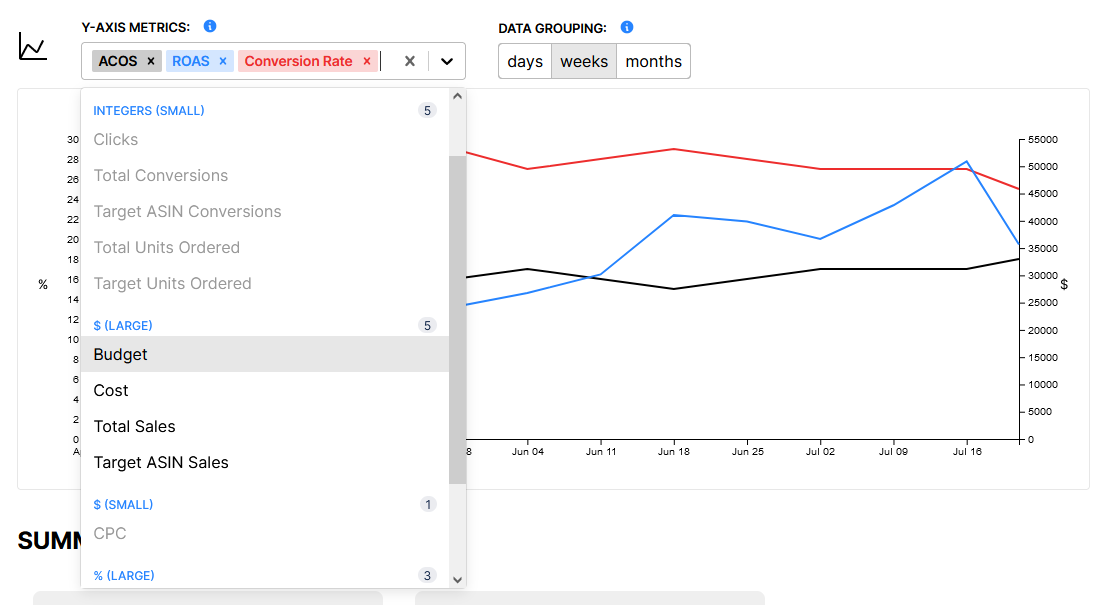
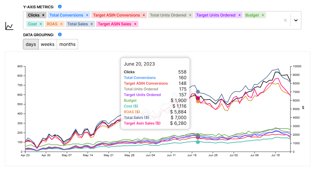
Therefore you can select as many metrics as you would like to display simultaneously, as long as all those metrics are in up to two groups.
Data Grouping
Data grouping let's you toggle whether the data is grouped by day, week or month. Sometimes it is usefuly to see daily performance, but so much detail in the chart can make it difficult to identify overall trends.
Here is the same chart (90 days) with the data grouped by day, week and then month.
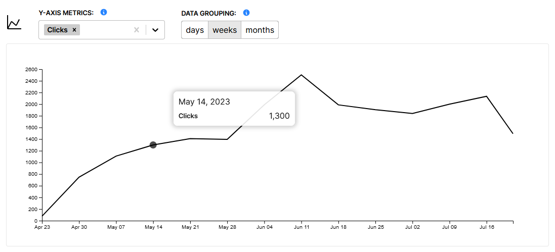
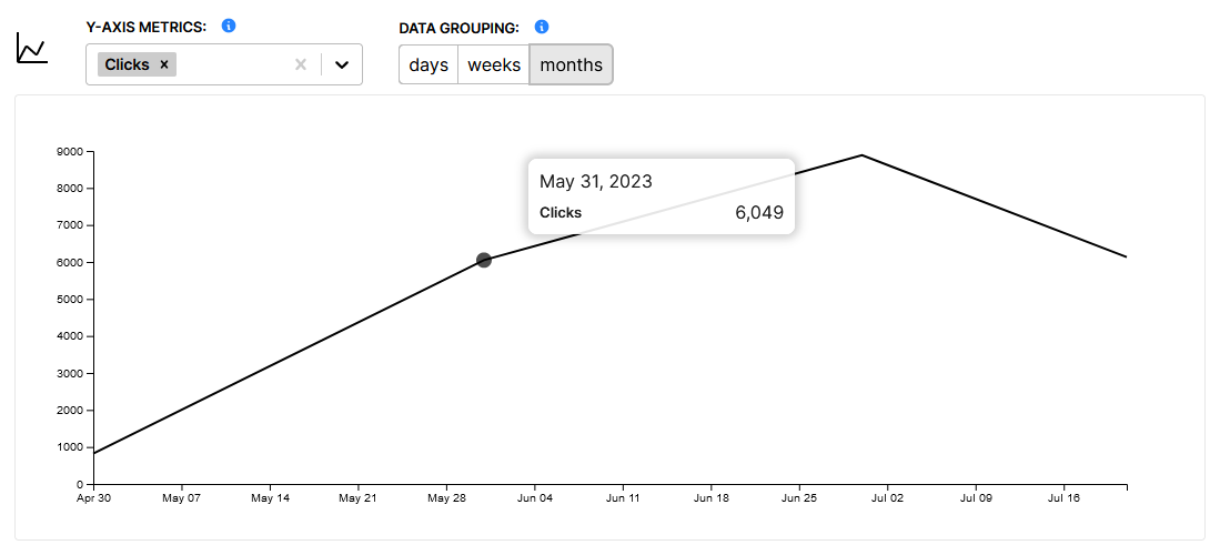
When viewing data grouped by week and month, the date given on the tooltip is the last date of that period.
It's also worth noting that when data is grouped by week or month it's common to see a dip in the first and last periods on the chart, as some of the days within those periods may fall outside the range of the chart. IE out of seven days in a week there may only be two or three days of data for that period.