Sunburst Chart
The Sunburst chart is a great way to visualize your ad structure. It can help you identify which parts of your ad structure are performing well, and which parts need your attention.
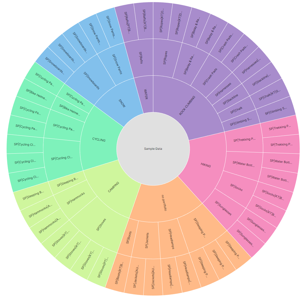
Although it may look intimidating at first, it's actually quite simple to use. The Sunburst chart is a variation of the Pie chart, but it is more suitable for displaying hierarchical data. In our case that would be Portfolios > Campaigns > Ad Groups.
In the example above, each color represents a different Portfolio, just like you would see in a Pie chart. However we can also see all of the Campaigns inside of that Portfolio, and all of the Ad Groups inside of each Campaign.
Hierarchy
Each ring in the chart represents a level in the hierarchy. The innermost ring consists of Portfolios, the middle ring consists of Campaigns and the outermost ring consists of Ad Groups.
Although it's interesting to be able to see all of the items in our ad structure, the chart get much more useful when we introduce Color Encoding and Area Encoding.
Color Encoding
Let's take a look at the same chart, but this time we will use Color Encoding to display the relative Cost of each item. The more money we spent on each item, the darker the green will be.
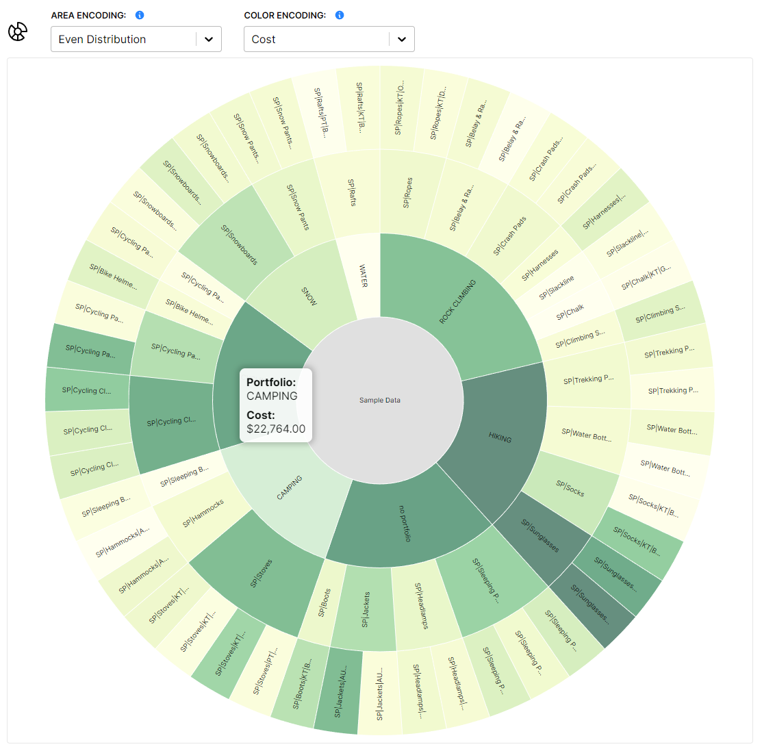
Now we can see not only the relationships between our ads, but also which portfolio spent the most money, and which campaign spent the most money inside that portfolio. We can see all of our most expensive items at a glance.
Let's change the color encoding to Average Cost Of Sale (ACOS).
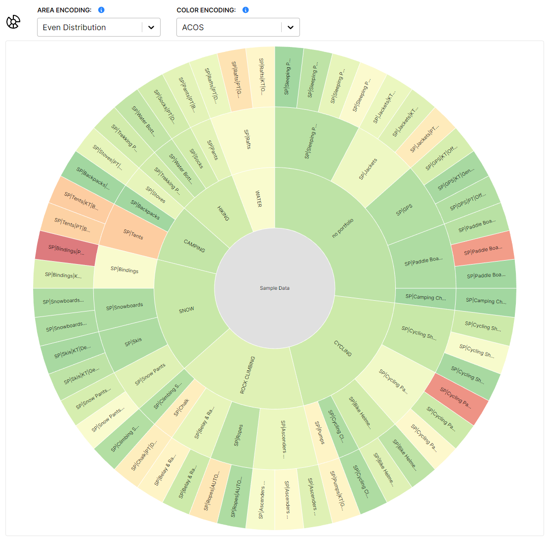
The color scale works differently for this metric. With the cost metric, spending more or less money isn't necessarily bad, so we don't want to color anything ominously red. ACOS however is a percentage based metric, where we know lower is better, so we can be a bit more opinionated about how we color things.
In this case, items with low ACOS will be green, and then the color will gradually shift to red as the ACOS gets higher. Very useful!
Area Encoding
We can go even further however. In addition to changing the color of each node, we can change it's size as well. This is called Area Encoding.
Let's take a look at the same chart. We will leave the colors unchanged, but this time we will use Area Encoding to display the relative Cost of each item. The more money a Portfolio/Campaign/Ad Group spent, the larger the node will be.
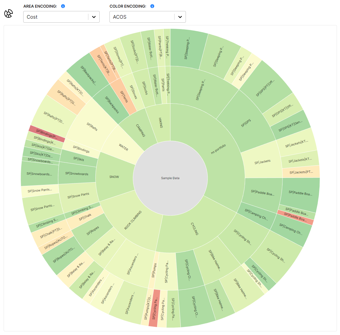
This is especially useful now. We can glance at this chart, and if there are any large and also red/orange nodes, we know immediately that those items require our attention. Those are items where we are spending a lot of money, and they are also performing poorly, which is what we are looking for!
This is just one possible combination of Color Encoding and Area Encoding metrics, you can set them however you like.
Navigation
Lastly, we can use the Sunburst chart to navigate to any item in our ad structure. If we click on any node, we will be taken to the corresponding bidbear page for that item, where we can analyze it in more detail.